Zussman's stone ends up nowhere near the proposed target, Eby stopping it with his right foot.
“Good sweeping,” Zussman says.
The question now is whether Eby's political calculations have similarly slid awry, as he faces a largely unknown opponent in interim B.C. Conservative leader Lorne Doerkson, whose sudden elevation has sent the election's stones ricocheting in unexpected directions. Eby called the snap Oct. 24 election just two days after Doerkson was installed.
When Eby first raised the possibility of a snap election in early September less than two years into his mandate, the Conservatives were undergoing self-immolation, suffering near-daily defections under the divisive reign of Kerry-Lynne Findlay.
But on Sept. 20, Findlay resigned.
It would go down as a hinge date in B.C. politics
That evening, NDP legislators met with campaign chair Cheryl Oates to discuss election plans in light of Findlay's exit. Later the same night, the Conservatives' board appointed Doerkson as interim leader, and he immediately set about persuading former Conservatives back to the party's caucus, including seven out of eight who had announced they were joining CentreBC days earlier.
With Findlay gone and the Conservatives coalescing, Eby nevertheless went ahead with the election call on Sept. 22. The question is why.
"The decision to go to an election was a serious one, and so is the moment, we face as a province," Eby said in an interview, betraying no hint of regret with the NDP lagging the Conservatives in recent polls.
"The decisive piece was for me whether or not we had a legislature to work, whether or not people had representatives that were actually going to stand up for what the priorities in the community were."
New Democrats held a one-seat majority with 47 seats at dissolution.
Former B.C. Liberal Mike de Jong, who served more than 30 years in the legislature, would have advised against an early election.
The NDP barely beat a "ragtag group" of Conservatives in 2024, he said, and there was a risk of being seen as manipulating the electoral process "purely for self-advantage" at a time when the Official Opposition was without a permanent leader, he said.
De Jong also pointed out the risk that an election call could unite the free-enterprise coalition.
He said Eby was "supremely confident in his own political instincts and his own political instincts, and his own political judgment."
"If it doesn’t turn out, it will be regarded as the biggest political blunder in this country, never mind this province, and that will be, for better or worse, within the NDP in particular, his legacy,” he said.
Eby’s biography shows no aversion to risk.
In 2011, when then premier Christy Clark needed a seat in the legislature after becoming leader of the B.C. Liberals, then 33-year-old Eby agreed to run and came within 564 votes of beating her.
Two years later, he reversed the result and cemented his reputation as a political giant-killer, beating Clark in a rematch.
Eby considered a leadership run after the NDP lost the 2013 provincial election. But he ruled himself out when he announced the pregnancy of wife his, Cailey Lynch, a doctor, with their first child, Ezra. They now have three children, with the addition of daughters Iva and Gwendolyn.
 B.C. Premier David Eby, back, and outgoing premier John Horgan embrace during a swearing in ceremony where Eby became the province's 37th premier at the Musqueam Nation, in Vancouver, B.C., Friday, Nov. 18, 2022.
THE CANADIAN PRESS/Darryl Dyck
B.C. Premier David Eby, back, and outgoing premier John Horgan embrace during a swearing in ceremony where Eby became the province's 37th premier at the Musqueam Nation, in Vancouver, B.C., Friday, Nov. 18, 2022.
THE CANADIAN PRESS/Darryl Dyck
Eby’s political responsibilities grew after the NDP regained power in 2017 under John Horgan, the late premier who routinely tapped him to handle difficult files, from housing to the remaking of auto insurer ICBC.
When Horgan stepped down, Eby became premier in 2022, in an uncontested race after activist Anjali Appadurai was disqualified.
Former federal NDP MP Megan Leslie, who attended the Schulich School of Law at Dalhousie University with Eby, says his upbringing in a suburban cul-de-sac home shaped him.
Eby was born in Kitchener, Ont., in 1976, the eldest of four children, whose father was a personal injury lawyer, and whose mother was a high school principal.
She said Eby’s father encouraged neighbours to create and maintain a communal space. “It’s incredibly special because the neighbourhood has self-organized to make sure that there are no fences in their backyards."
As a teenager, Eby protested the treatment of elephants when the circus came to town, and he is a vegetarian.
Eby and Leslie's friendship dates back to orientation at law school during a bus trip to Peggy’s Cove. "I sat beside this really tall guy," she said. Eby is six-foot-seven.
Leslie shared her doubts about going to law school. “He said, 'well, I feel the same way. So, I bet there are other people who feel like this too. So, why don’t we start an activist club?’”
Leslie said this was the origin of the Social Activist Law Student Association.
"Dave challenged us," she said.
But she said Eby also had fun while at law school. He expanded Leslie's musical tastes, downloading music through Napster, and they performed karaoke together — Eby was "really good" at Whitney Houston’s "Greatest Love of All," and they also performed the B-52’s "Love Shack" as a duet, involving a feather boa.
"Guilty as charged," Eby said of Leslie's account.
Eby also sang and played guitar for Vancouver-based bands including Ladner and World of Science. He had permanently moved to the city in the early 2000s.
After graduation, Eby articled for the federal Department of Justice in Vancouver, before joining Pivot Legal Society in 2005, located in Vancouver's Downtown Eastside to offer legal support to one of Canada's poorest neighbourhoods.
In 2008, he joined the British Columbia Civil Liberties Association as executive director. Former president Robert Holmes said Eby’s impact was immediate.
"He managed to get the office humming and everybody working on their specific projects," he said. "Plus, he was in the news an awful lot."
This energy differentiated Eby. "He had drive and energy directed to the job at hand, and he pursued that," said Holmes
But Clark thinks Eby "has a real execution problem.”
"I don’t think I have ever seen a politician, who is so bad at delivering results," she said.
Clark and De Jong point to B.C.'s projected deficit of almost $14 billion — Eby inherited a surplus from Horgan. De Jong said Eby’s handling of the Declaration on the Rights of Indigenous Peoples Act has been "clumsy" at best.
"I think he wishes to contribute positively to the province," de Jong said. "I don't agree with many of the pathways he has take, but I have never questioned his motivation."
Clark warned against counting Eby out.
"I always thought of David Eby as a very serious opponent in the fight," Clark said. "I have never thought of him as a serious person when it comes to governing, but when it comes to elections, he’s a very tough opponent."
Eby himself said the race is continually shifting. He said he would wait to see what election day brings, when asked if he would stay on as leader of the NDP after a loss.
"If this province is anything, it is a province that pays attention and makes important decisions in key moments," he said.
"I have faith in the voters of B.C. to set us on the right track, and that is why I’m putting the question in front of them."
This report by The Canadian Press was first published Oct. 14, 2026.
By Wolfgang Depner | Copyright 2026, The Canadian Press. All rights reserved.




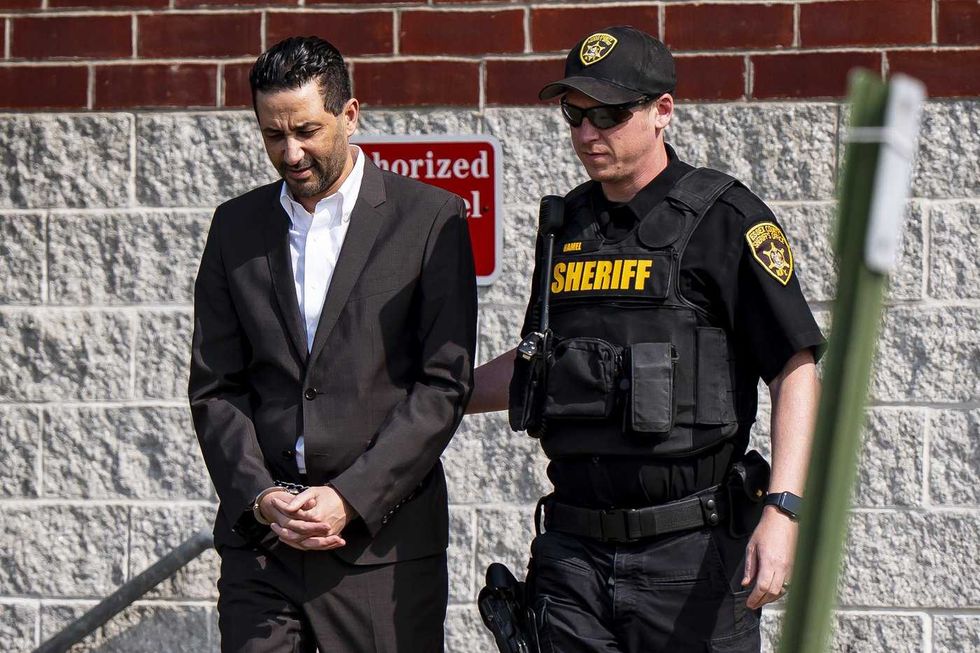 Luciano Frattolin is taken away in custody from the Essex County Court in Elizabethtown, New York on Friday, July 24, 2026. Luciano Frattolin charged with 2nd-degree murder and concealment of a human corpse.
THE CANADIAN PRESS/Christopher Katsarov
Luciano Frattolin is taken away in custody from the Essex County Court in Elizabethtown, New York on Friday, July 24, 2026. Luciano Frattolin charged with 2nd-degree murder and concealment of a human corpse.
THE CANADIAN PRESS/Christopher Katsarov Police officers open the back of a recovered truck during a press conference regarding Project 24K, a joint investigation into the theft of gold from Pearson International Airport, in Brampton, Ont., on Wednesday, April 17, 2024.
THE CANADIAN PRESS/Arlyn McAdorey
Police officers open the back of a recovered truck during a press conference regarding Project 24K, a joint investigation into the theft of gold from Pearson International Airport, in Brampton, Ont., on Wednesday, April 17, 2024.
THE CANADIAN PRESS/Arlyn McAdorey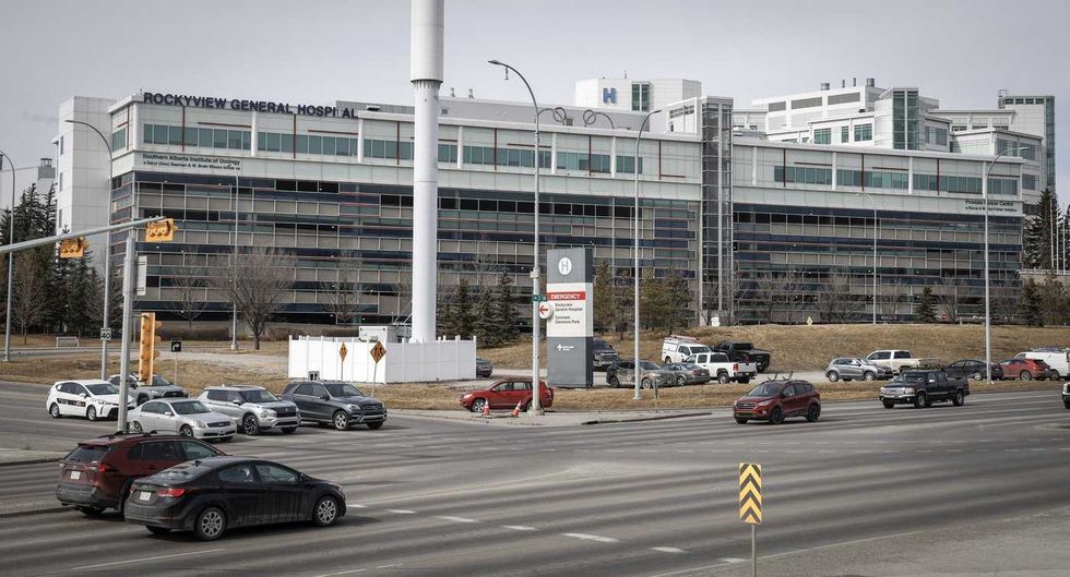 The Rockyview General Hospital is pictured in Calgary, Thursday, March 20, 2025.
THE CANADIAN PRESS/Jeff McIntosh
The Rockyview General Hospital is pictured in Calgary, Thursday, March 20, 2025.
THE CANADIAN PRESS/Jeff McIntosh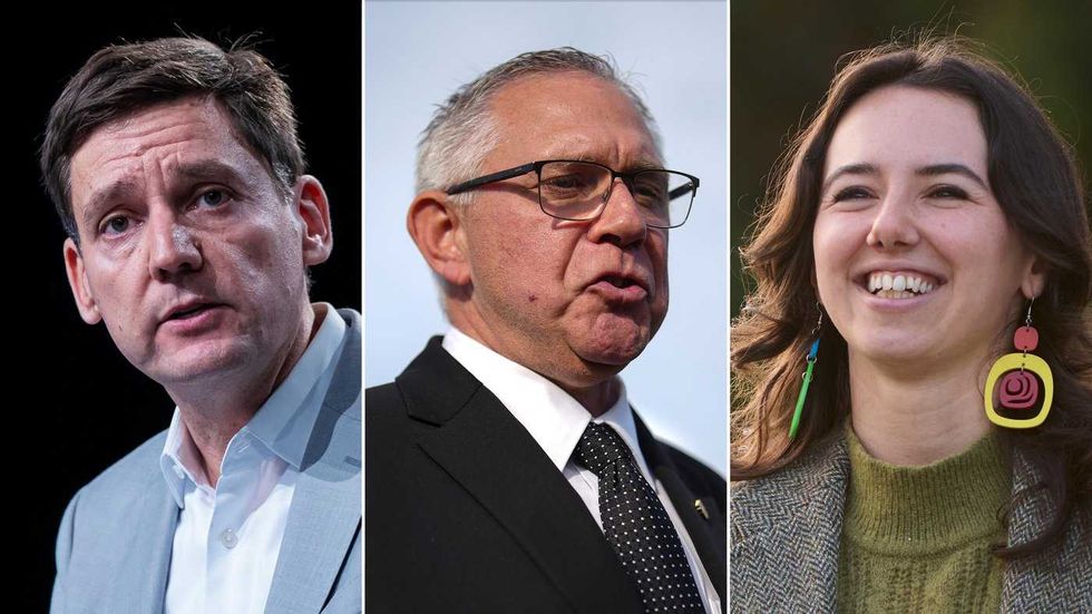 This composite image shows, left to right, B.C. NDP Leader David Eby in Vancouver, on April 13, 2026; B.C. Conservative interim Leader Lorne Doerkson, in Vancouver, on Sept. 22, 2026; B.C. Green Party Leader Emily Lowan in Victoria, on Sept. 23, 2026.
THE CANADIAN PRESS/Darryl Dyck, Rich Lam, Kevin Light
This composite image shows, left to right, B.C. NDP Leader David Eby in Vancouver, on April 13, 2026; B.C. Conservative interim Leader Lorne Doerkson, in Vancouver, on Sept. 22, 2026; B.C. Green Party Leader Emily Lowan in Victoria, on Sept. 23, 2026.
THE CANADIAN PRESS/Darryl Dyck, Rich Lam, Kevin Light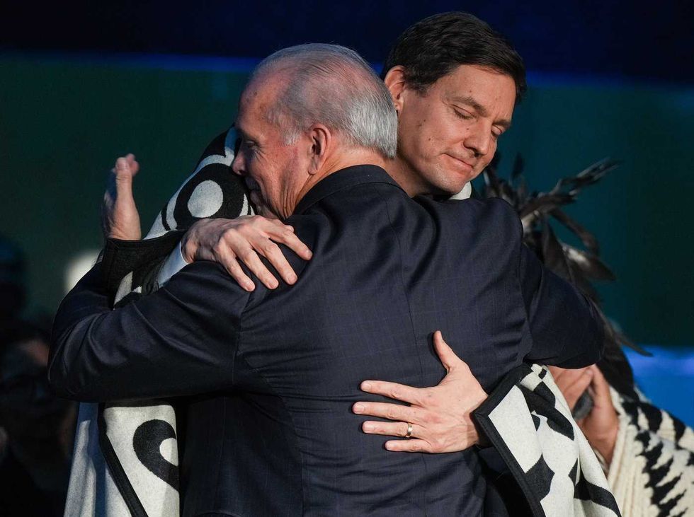 B.C. Premier David Eby, back, and outgoing premier John Horgan embrace during a swearing in ceremony where Eby became the province's 37th premier at the Musqueam Nation, in Vancouver, B.C., Friday, Nov. 18, 2022.
THE CANADIAN PRESS/Darryl Dyck
B.C. Premier David Eby, back, and outgoing premier John Horgan embrace during a swearing in ceremony where Eby became the province's 37th premier at the Musqueam Nation, in Vancouver, B.C., Friday, Nov. 18, 2022.
THE CANADIAN PRESS/Darryl Dyck